Converting more visitors into customers is an obvious objective when you plan a new website with your digital design agency. How you achieve that conversion can be more difficult. Here we provide some help...
Start by asking yourself: what does your customer want to do?
That’s a subtle shift in focus from thinking about what you as a business want them to do. But having their needs in mind when planning your website will make all the difference in converting customers.
A website design agency such as me&you needs to produce a website that helps your target customer crack on with a task quickly and easily, on both desktop and mobile. None of us have patience for complexity or bad functionality anymore! We call it a website with ‘a frictionless experience’.
Make what your customer wants to do easy!
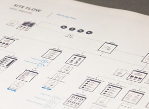
 Below are some good examples of responsive websites created by the me&you team. At the planning and research stage, we created a customer journey that is beautifully simple. In technical language this is ‘applying UX’ - in other words, creating the best possible User Experience. We go further than just creating a sitemap for you, we also produce a site flow to demonstrate how a customer best ‘flows’ through your site to a defined goal. Useful when you plan a new website!
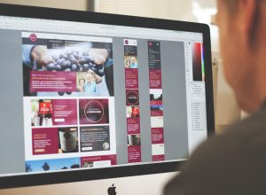
me&you produced Champagnes & Châteaux’s 2016 website, and then returned to our design agency for the new 2018 version, which opened their offering up to consumers as well as trade for the first time. Here we’ll look at the consumer:
Who is the primary customer?
A fine wine consumer
What does the customer want to do?
- Buy limited edition fine wine online from experts
- Explore detailed information about the winemakers and read tasting notes
How did me&you design agency make this purchase easy to carry out?
Our website designers placed the ‘Wine Shop’ section prominently and created a robust search function with lashings of choice for the customer. The customer can be as specific as they wish in their search, or as broad as simply clicking ‘France’ as a filter. The results pop up quickly, the product photographs are high quality and our developers’ experience in ecommerce delivered an easy online ordering process from start to finish.
 We test and refine all our websites, to ensure transactions run smoothly. Behind the scenes, the eCommerce functions are doing lots of clever things - calculating shipping costs dependent on postcode, managing stock-level and more. But the customer doesn’t need to know any of that - they just discover and buy with ease.
Voilà! Website visitor converted to customer.
How does the website fulfil customer needs not met on another site?
The well-organised products and hierarchy of information enables the names and prices of rare wines to come up on Google searches, and lead consumers into the Champagnes & Châteaux site. In this way customers can find a wine they have enjoyed in a restaurant, to drink at home.
Who is the primary customer?
A cyclist
What does the customer want to do?
- Get a quote for cycle insurance from a specialist
- Then purchase the cycle insurance - at a good price and hassle-free
 How did me&you design agency make this process easy to carry out?
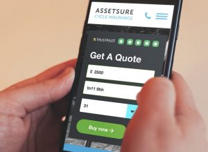
There is no messing around with a long-winded introduction on this site! We get straight to the nitty gritty of filling in boxes about your cycle on the homepage. The form looks simple and quick - no one will be put off by this. An indicative quote is generated straight away, from just 3 pieces of information.
A prominent ‘Trustpilot’ logo and 5 stars are really effective on the homepage too. We’ve immediately communicated ‘trust’ to the Assetsure customer visually. When you plan a new website, find out what is important to your customer first, and then be sure to communicate it.
An invaluable part of our process is to create a working prototype to test the user experience and share it with you before any hard coding is undertaken.
How does the website fulfil customer needs not met on another site?
If you compare our site design Cycles.assetsure.com with a competitor’s such as Cycleplan or Wiggle insurance, you’ll see how much clearer ours is. It’s a real skill to organise website information effectively - design is as much about clarity as style.
We’re pleased to say that this transformation of user experience by me&you resulted in a 20% increase in online sales of cycle insurance for Assetsure!
It goes without saying that our websites are responsive - meaning that the site design adapts to any screen size - mobile, tablet and desktop. Plan a new website with no pinching or horizontal scrolling needed by the customer.
Let’s discuss what your customers want from your website, and we’ll help you deliver it. me&you is Your Creative Company.
Contact Matt Eamer on 01732 749 748.
Blog 01.03.2019