• Call Us 01732 749 748
    [email protected]

  • We will never share your details with other organisations.
    View our privacy statement for more details.

  • This field is for validation purposes and should be left unchanged.

Close

Building an Event Brand that Lasts

The Kent County Show: 94 years of charity and community


Overview

As marketers, we often pour our energy into compelling event campaigns for the immediate period, only to find ourselves reinventing the wheel the following year. But what if your event's creative could not only captivate for today but also lay a foundation for enduring appeal, growing stronger with each passing year? This was the challenge - and the exciting opportunity - presented by the Kent County Show.

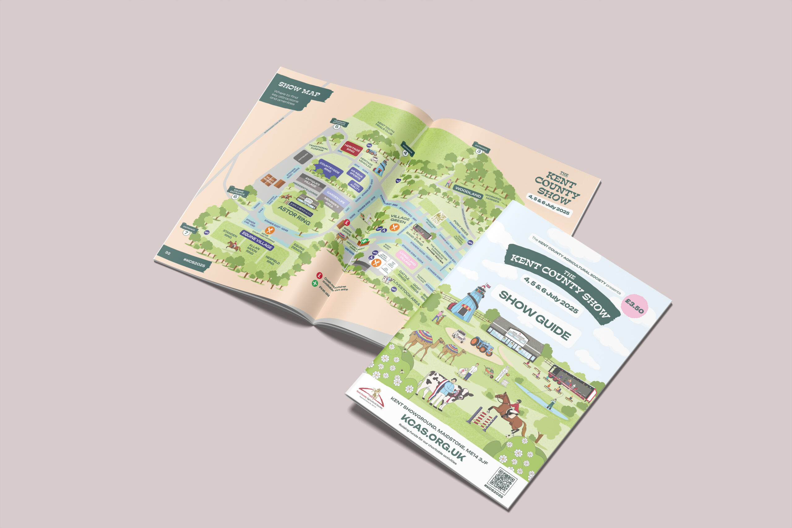
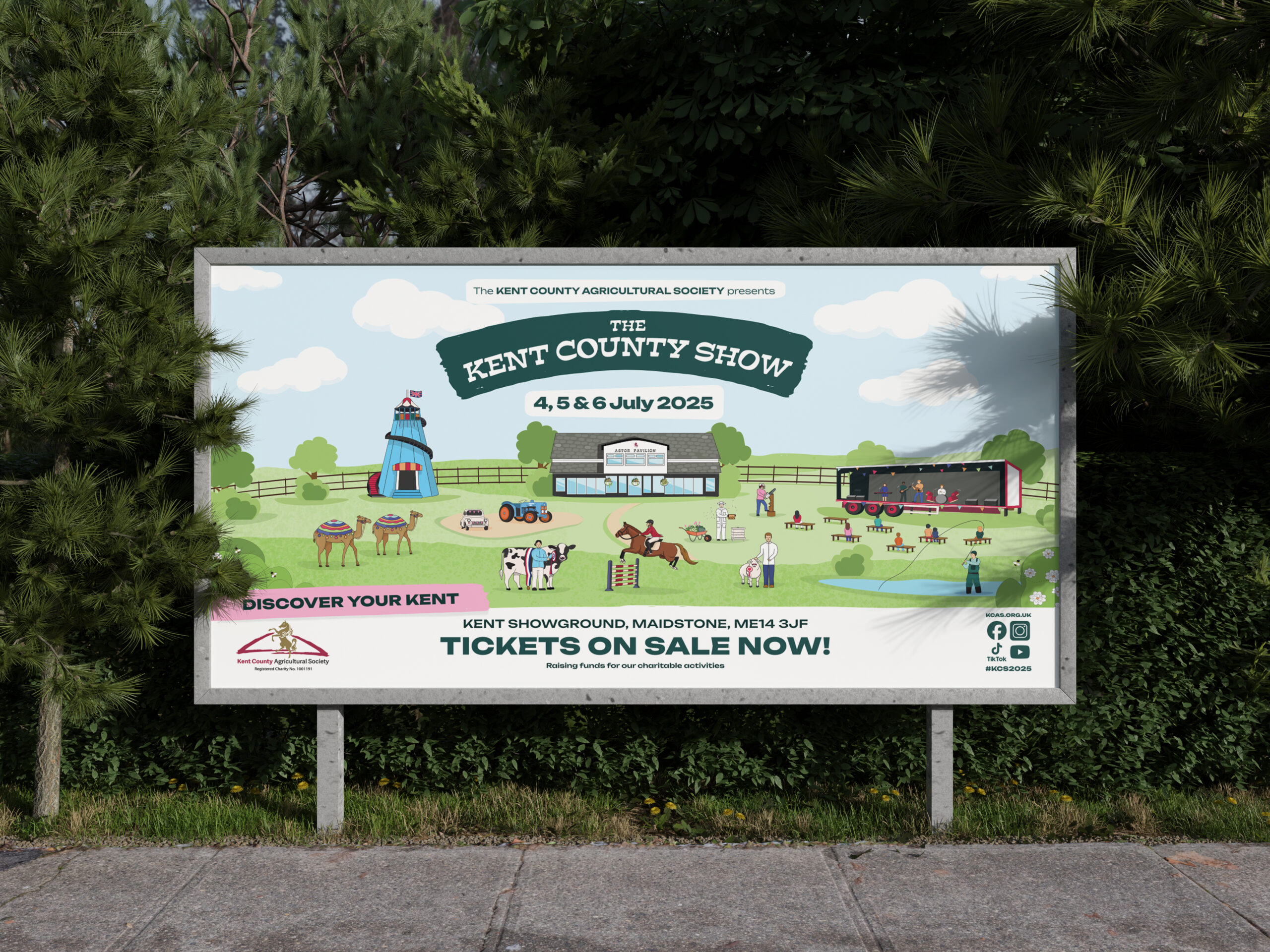
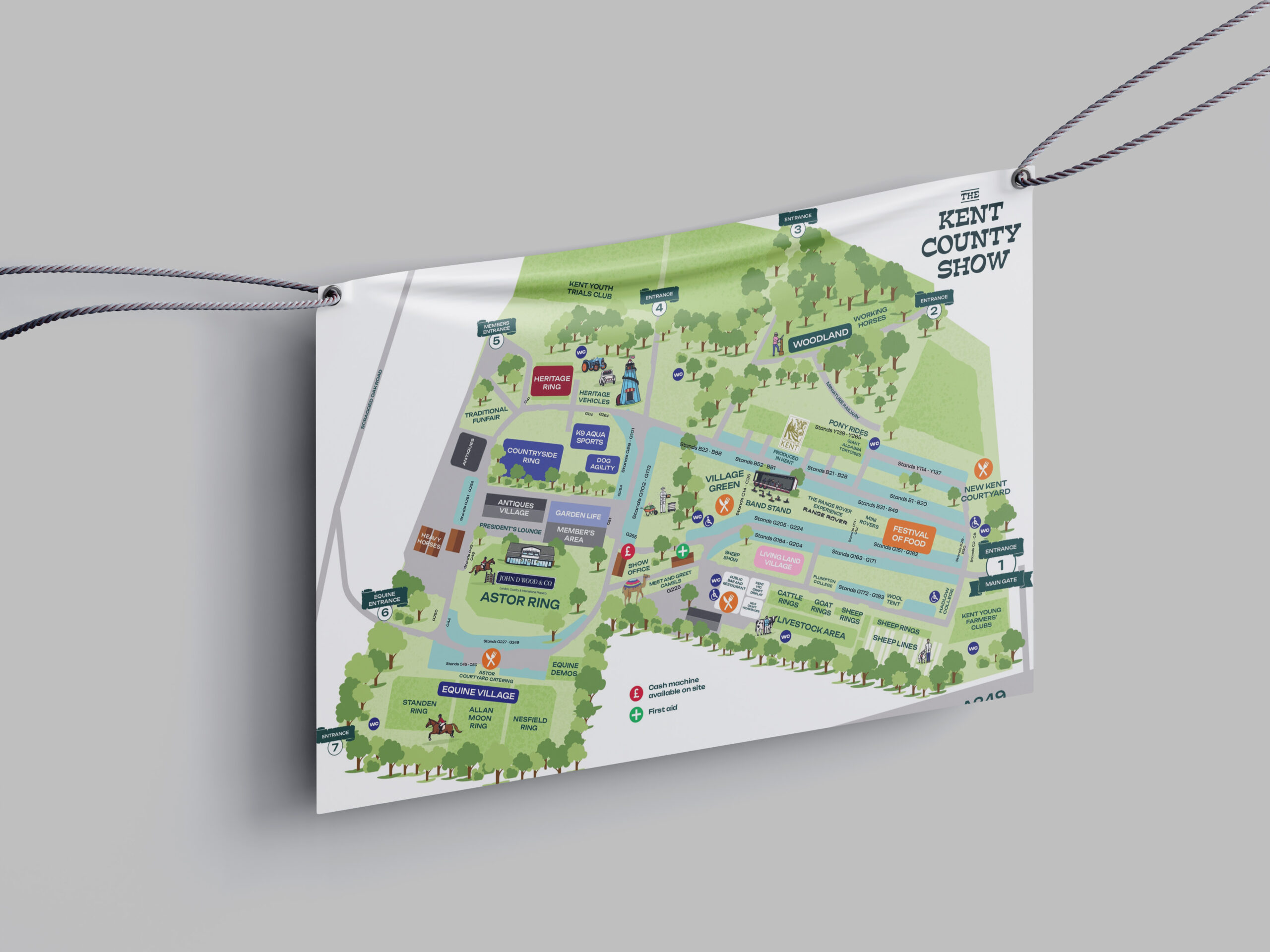
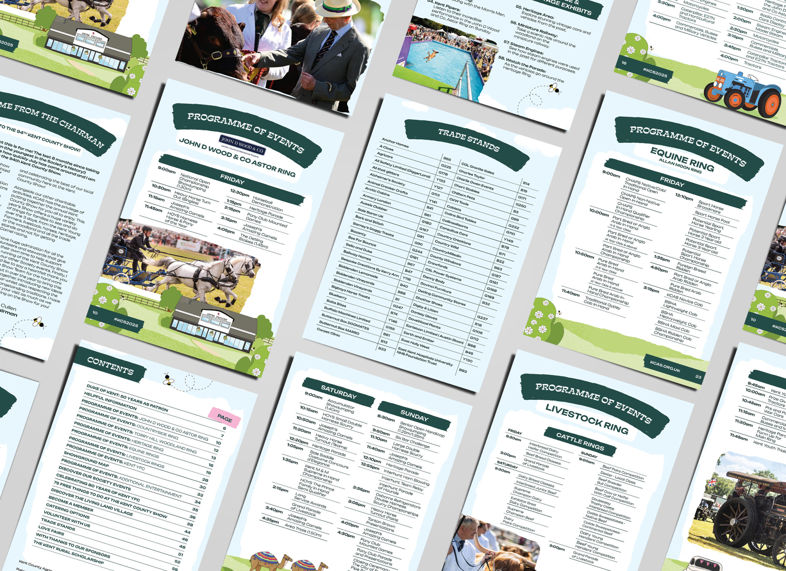
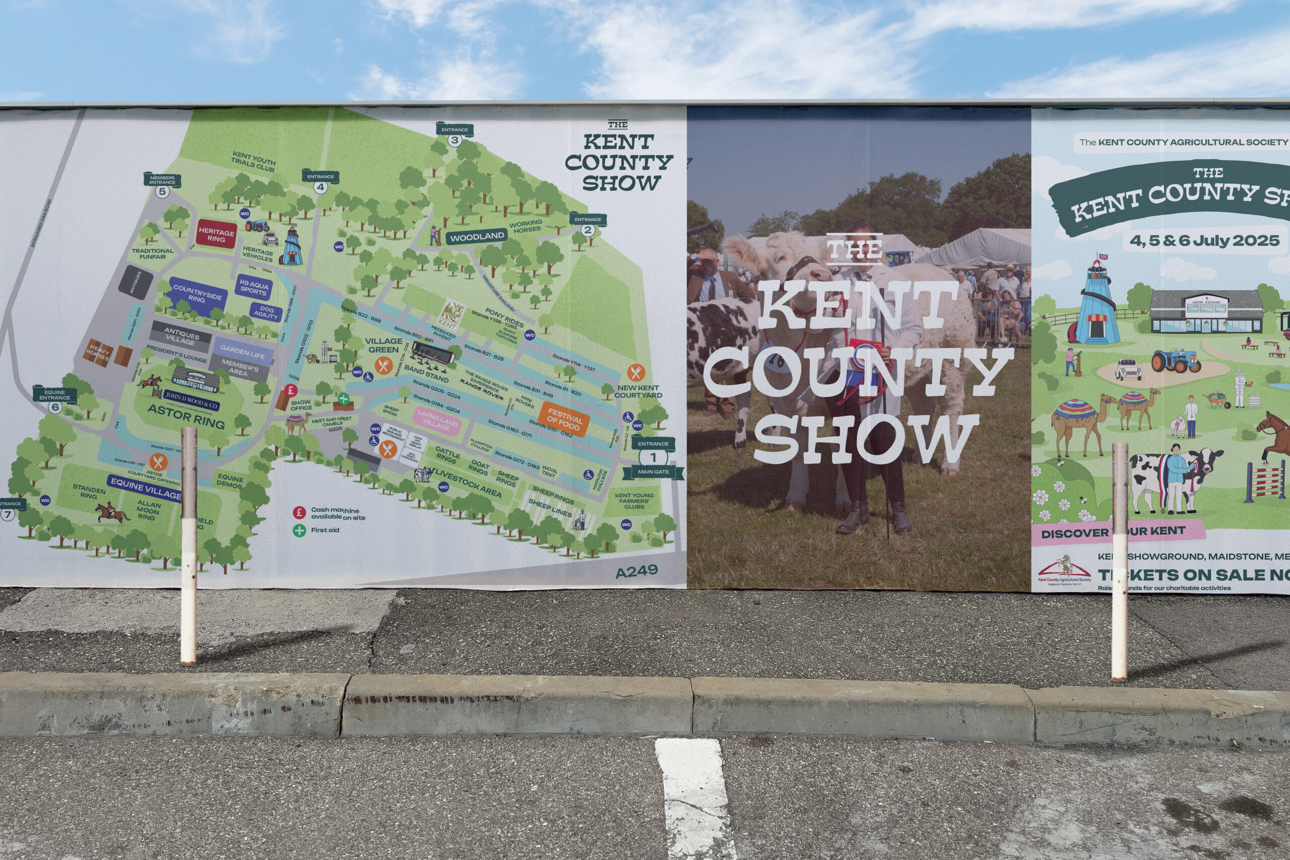
The Kent County Show, a celebrated cornerstone of the agricultural calendar since 1923, is more than just a three-day event; it's a legacy. Attracting over 70,000 people annually, its core mission is to educate visitors on the vital role of farming and the rural sector, all while delivering a "fun family experience". Their previous creative efforts, while effective for the moment, highlighted a need for a long-term, overarching brand creative that could be used ongoing. The goal was to establish a brand that felt both historically prestigious and modern, reflecting the show's evolution while maintaining its agricultural roots.

Challenge

 From annual splash to enduring narrative

The Kent County Agricultural Society understood that a truly impactful brand needed to transcend a single year's campaign. They faced the common marketing manager's dilemma: how to create a consistent, recognisable identity across diverse marketing channels - from super-wide billboards to small passes and digital assets - while allowing for refreshing updates and highlighting specific features, like the beloved livestock competitions or new attractions. They also sought a strong, collaborative relationship with their creative agency, a key factor given past difficulties with staff changes and communication errors.

Their vision was clear:

  • A strong sense of place: Utilising the iconic Astor Pavilion building as a central creative element.
  • A versatile visual language: Exploring a range of colours with a featured "highlight colour" changing year-on-year, and illustrations designed as separate assets for flexibility.
  • Nostalgic "rolling features": Acknowledging the reliable pull of livestock while embracing occasional standouts like camel racing.
  • Consistent messaging: Highlighting the show as educational, interactive, entertaining, and "for everyone".

Solution

Crafting a Flexible Framework for Lasting Impact

Our partnership with the Kent County Agricultural Society began with deeply understanding their rich history, their commitment to the community, and their aspirations for the future. We focused on developing a brand framework that wasn't just a design, but a system built for longevity and adaptability.

Instead of a rigid template, we created a flexible visual language that allowed for annual updates without losing core brand recognition. We guided the illustration style to be evocative and nostalgic, similar to elements the client admired from competitors like the Royal Three Counties Show 2016, but ensuring it wasn't "too cartoon-like". Critically, we ensured the iconic Astor Pavilion was seamlessly integrated, providing that crucial "sense of place".

A key aspect was designing illustrations as separate assets. This seemingly technical detail became a pivotal solution, empowering the Kent County Show's in-house team to utilise and adapt the creative across various platforms, from print items like the show guide and ticket wallets to digital advertisements and social media graphics. This collaborative approach, focused on empowering the client, was essential for building the strong relationship they desired.

The Outcome

A Brand Ready for the Next Century

As the 94th Kent County Show unfolds (July 4-6, 2025), we're immensely proud to see the revitalized brand in action. The new creative delivers on its promise:

  • Visual Appeal and Consistency: The design stands out as visually appealing and is consistent across all marketing channels and media.
  • Modern Yet Rooted: The branding feels in keeping with their prestigious history and agricultural roots, while being modernised to reflect the fun, family quality of the event.
  • Empowered Internal Team: The flexible asset system allows their team to manage expectations and confidently use the creative.
  • Enhanced Awareness: By weaving messaging about the Kent County Agricultural Society's charitable work and history into the show branding, customer awareness is increased.

This isn't just about a new look for 2025. It's about establishing a robust, adaptable brand identity that can be carried forward to future shows, a brand that resonates with its primary audience of families seeking a great day out, and inspires trade exhibitors and sponsors.

We're on-site this week, not just celebrating the success of this campaign, but also catching up with our other valued clients such as Consultus. It's truly rewarding to witness the power of a well-crafted, long-term creative strategy in action.

Got a similar project in mind? >

What marketing challenges are you facing that demand a long-term, strategic approach? Let's discuss how we can build a brand that not only captivates today but thrives for years to come.

Call Us: 01732 743 455

Email: [email protected]

Book a Call