• Call Us 01732 749 748
    [email protected]

  • We will never share your details with other organisations.
    View our privacy statement for more details.

  • This field is for validation purposes and should be left unchanged.

Close

Fast work! Rebrand and two websites in just three months

Building services rebrand and website design

me&you design agency helped this building services market-leader to transform their brand.


You’ll probably be as impressed as we were that our building services client D Hammond Group maintains Buckingham Palace! Moving in such high circles meant that their new brand and website had to reflect this professionalism. D Hammond Group were confident that me&you could deliver.

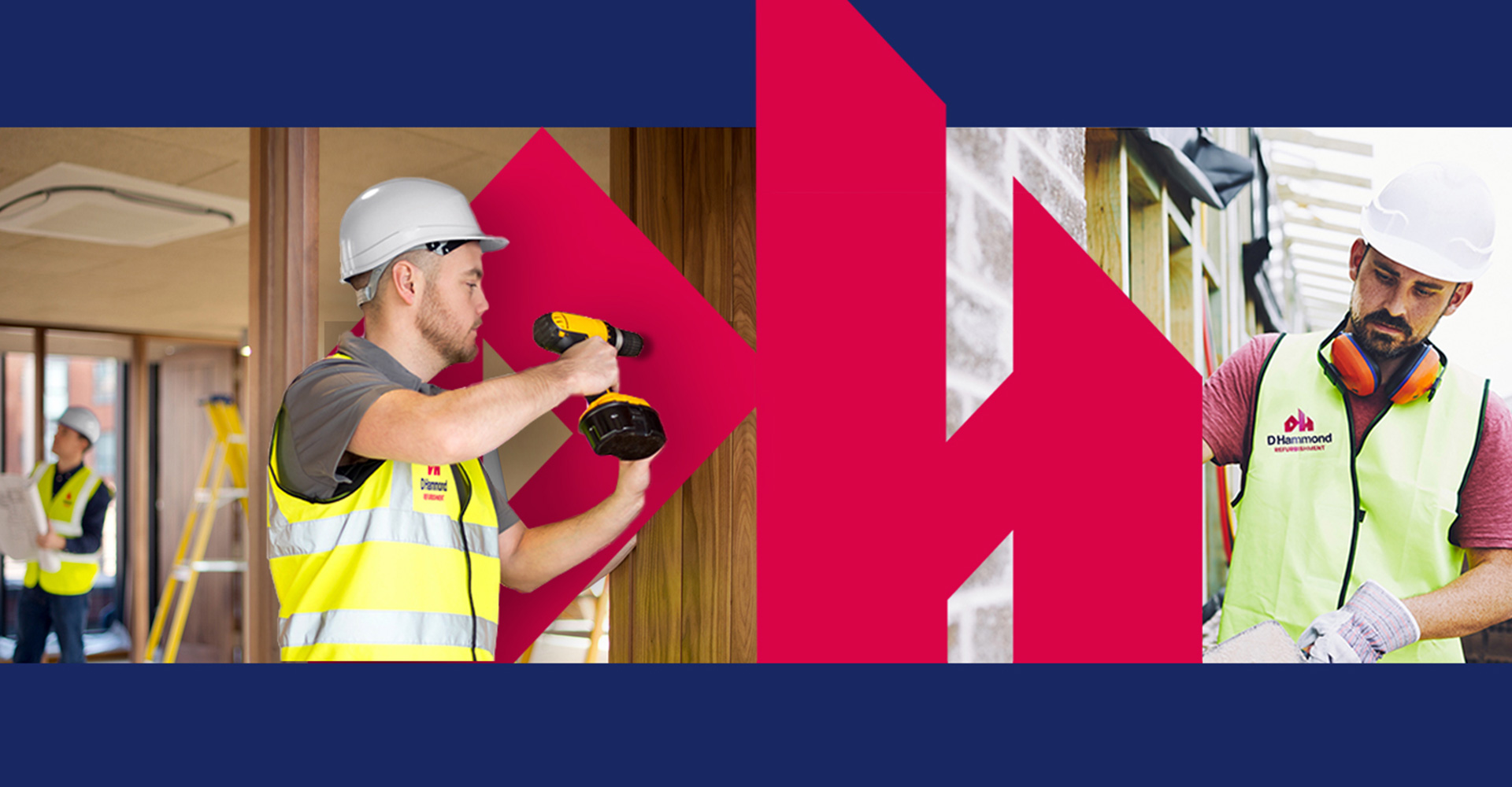
We love a challenge at me&you design agency, and this project was no different. Just three months were available to complete a rebrand of two sister companies, create the two websites, shoot a new gallery of photography and devise a marketing strategy.

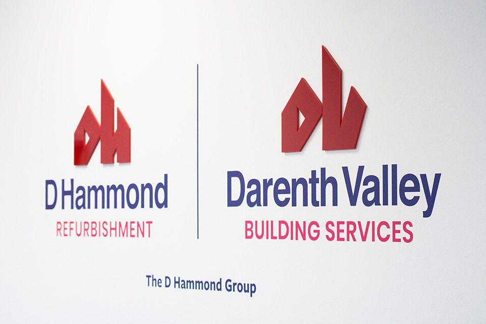
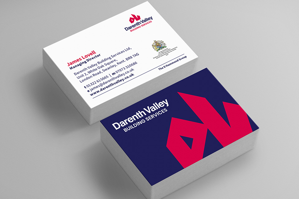
The creatives at me&you got cracking on the rebrand first of all. The sister companies in the group are Darenth Valley and D Hammond, and our contemporary new brand for them uses straplines to clearly define what each does - refurbishment for one business, and property maintenance for the other. The two are linked visually through a consistent colour palette and the structure of their logos.

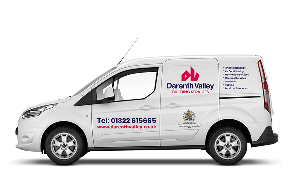
Take a look below at how we applied the new brand to corporate stationery, vehicle livery, staff uniforms and the websites.
Photography

Corporate identity

Digital

Two new websites

When we devised the sitemap and site flow for the new responsive websites, always in mind was how commercial property managers such as Savills will want to view our client’s services. What are they looking for? What do they need? We recommended a structure that is very easy to navigate on both desktop and mobile.

View the D-Hammond site

View the Darenth Valley site

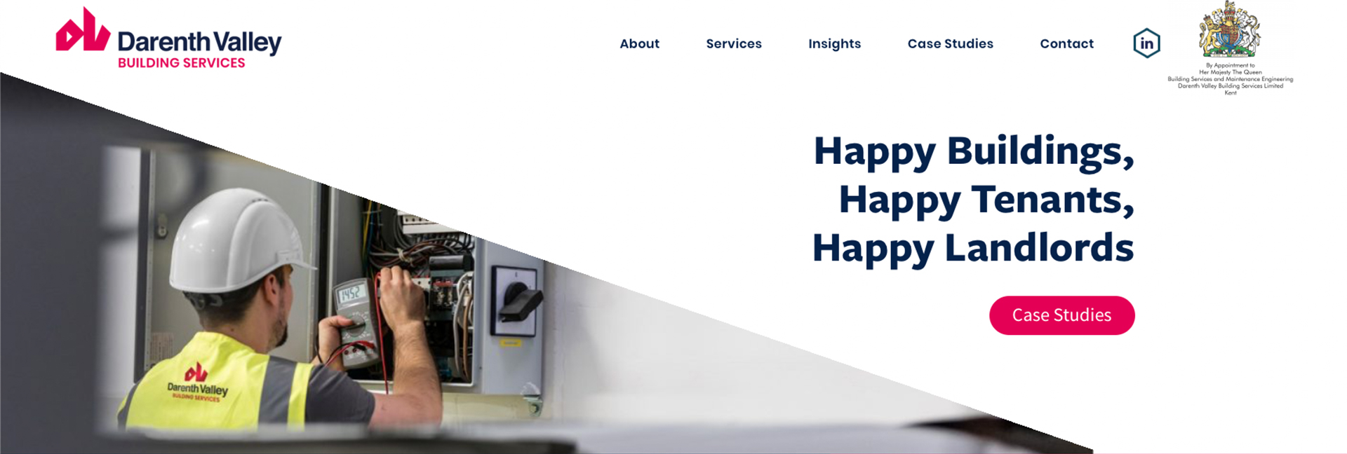
A positive, uplifting statement greets website visitors at both sites: ‘Happy Buildings, Happy Tenants, Happy Landlords’, creating a great first impression.

Just five sections are offered on the homepage main menu - About, Services, Insight, Case Studies and Contact. This enables the building services websites to look uncluttered. Submenus are revealed as drop-downs. The all-important Royal Warrant is of course given a prominent position too!

Explore the portfolio of me&you design agency to see branding and websites we’ve created for other industries - leisure, food and drinks, financial services, property, education and health.