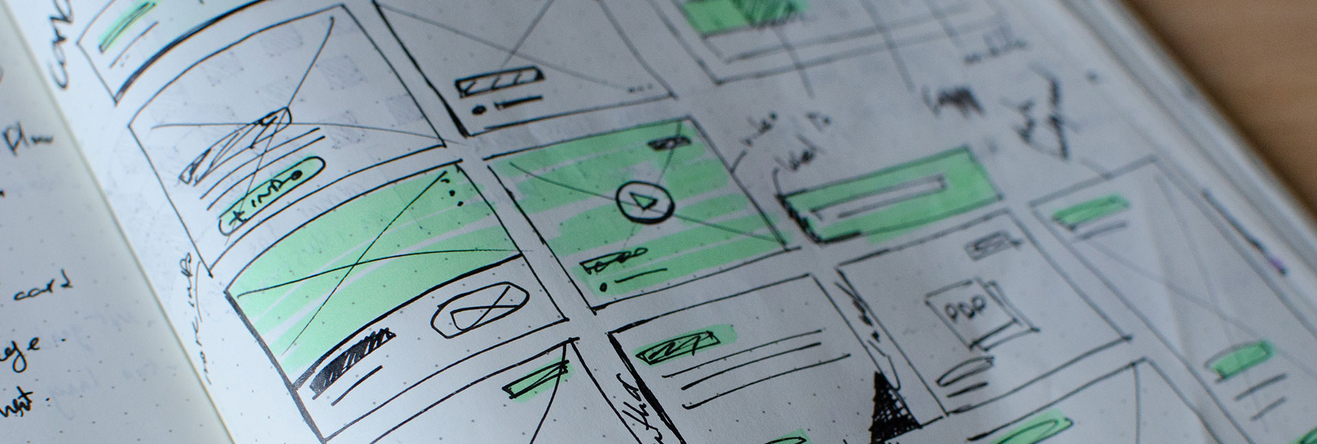
Are you making these UX mistakes? Don't worry, you are not alone! There are many misconceptions about how a user will abandon your website. In the short video below, we break the dogma and tell it like it is!
Are you making these UX mistakes?
UX design is about usability
This is true, but it is more than this – it’s giving people a meaningful experience. It’s as much about how the person is feeling when they use your product or website – if they are happy from start to finish, this is a very good user experience!
The homepage is the most important page
With search engine improvements, people can land on any of your website pages that matches their search query. Therefore, each page needs to have a clear structure and hierarchy of information.
All pages should be accessible in 3 clicks or 2 taps
People don’t leave your site or app if they are unable to find the desired information in 3 clicks or 2 taps. The number of clicks has no bearing on user satisfaction, nor success rate.
What counts is the ease of navigation and giving the user a constant thread of information. If the user isn’t thinking about thr clicks, they won’t mind making a few extra on their journey.