• This field is for validation purposes and should be left unchanged.
  • Call Us 01732 749 748
    [email protected]

  • We will never share your details with other organisations.
    View our privacy statement for more details.

Close

Building on Kent Community Foundation’s heritage with a refreshed identity

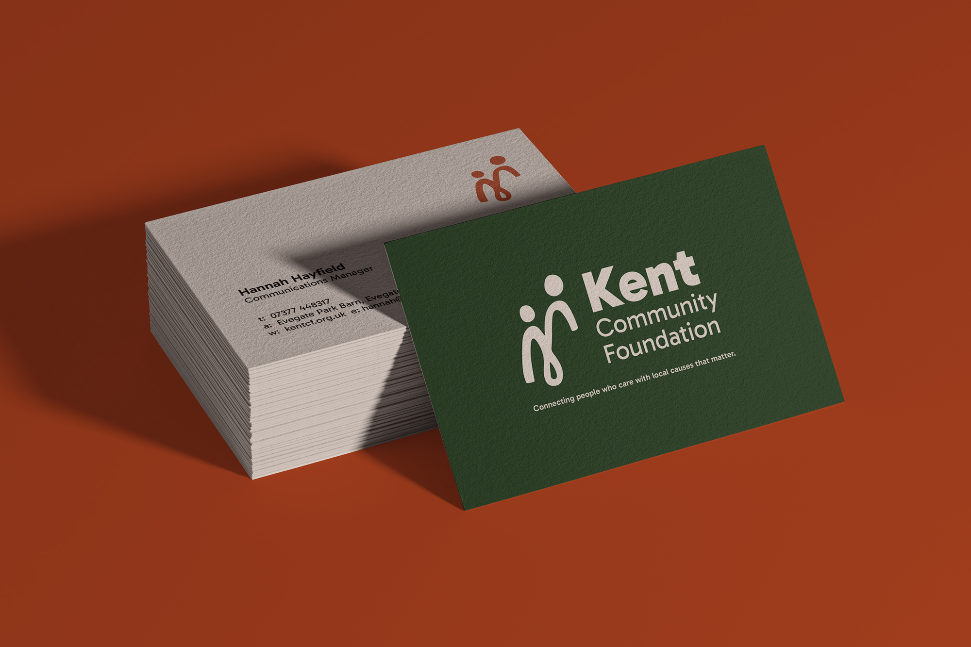
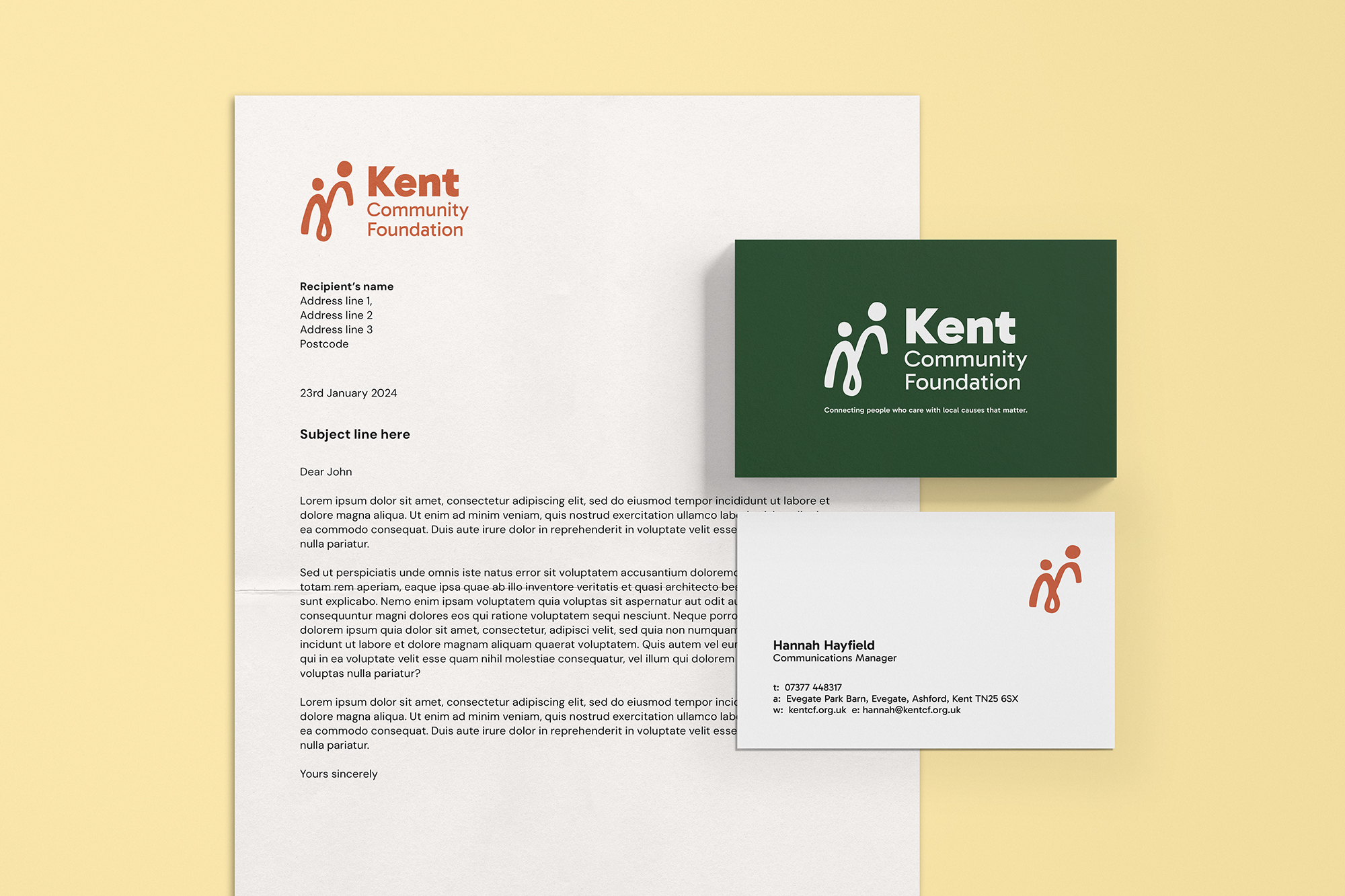
me&you collaborated closely with Kent Community Foundation to evolve their brand to make it more accessible and inclusive.


Challenge

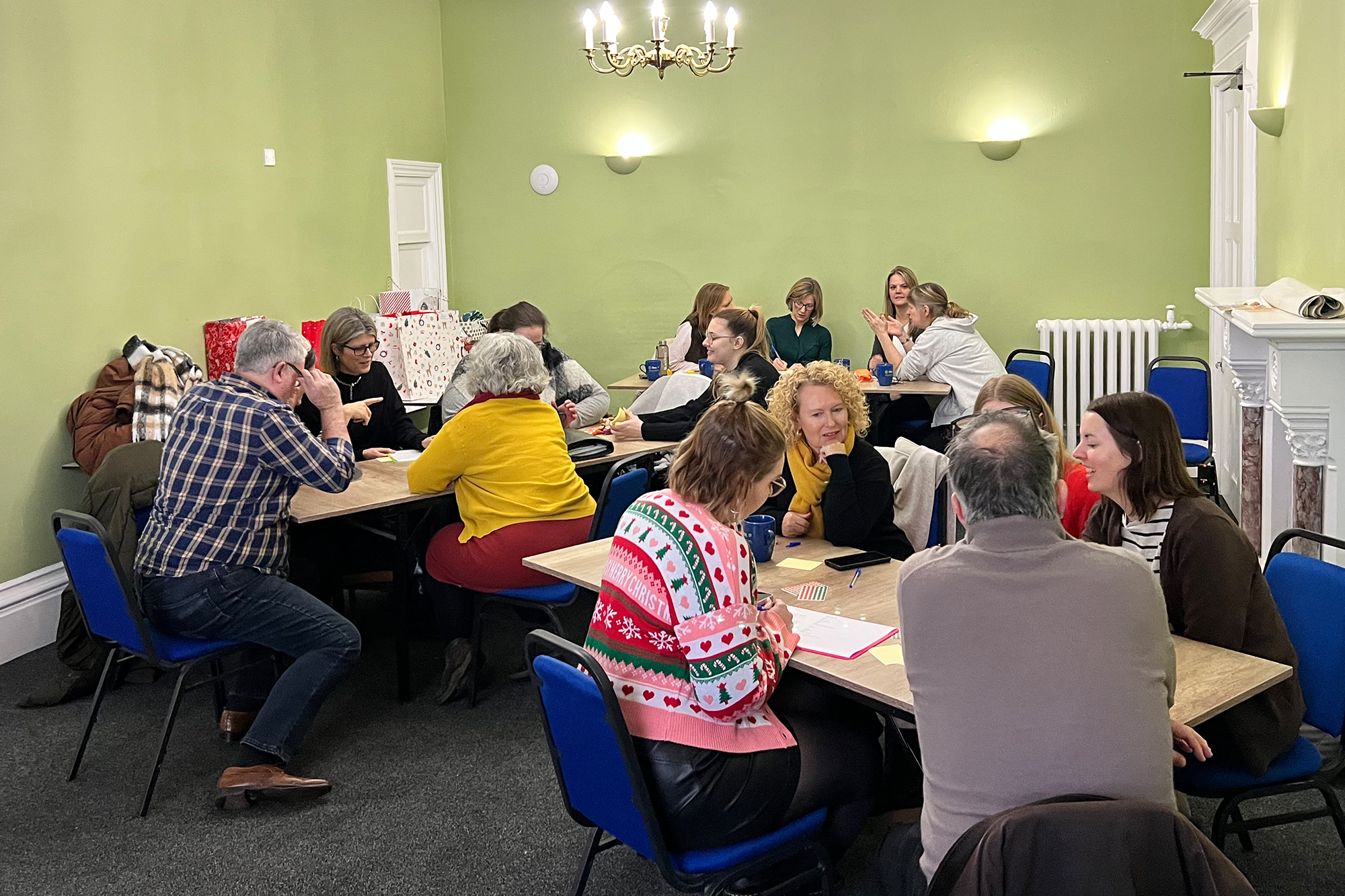
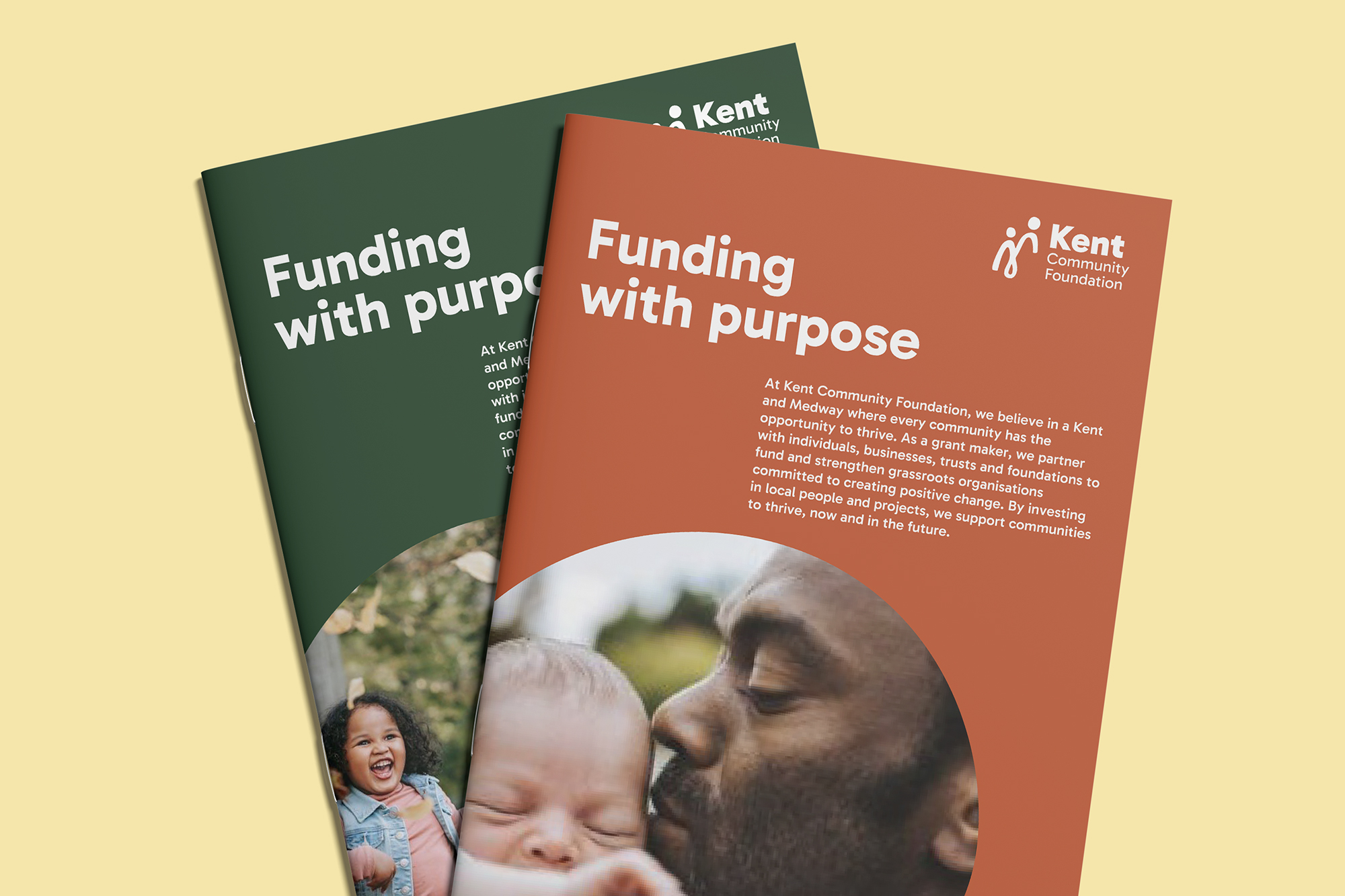
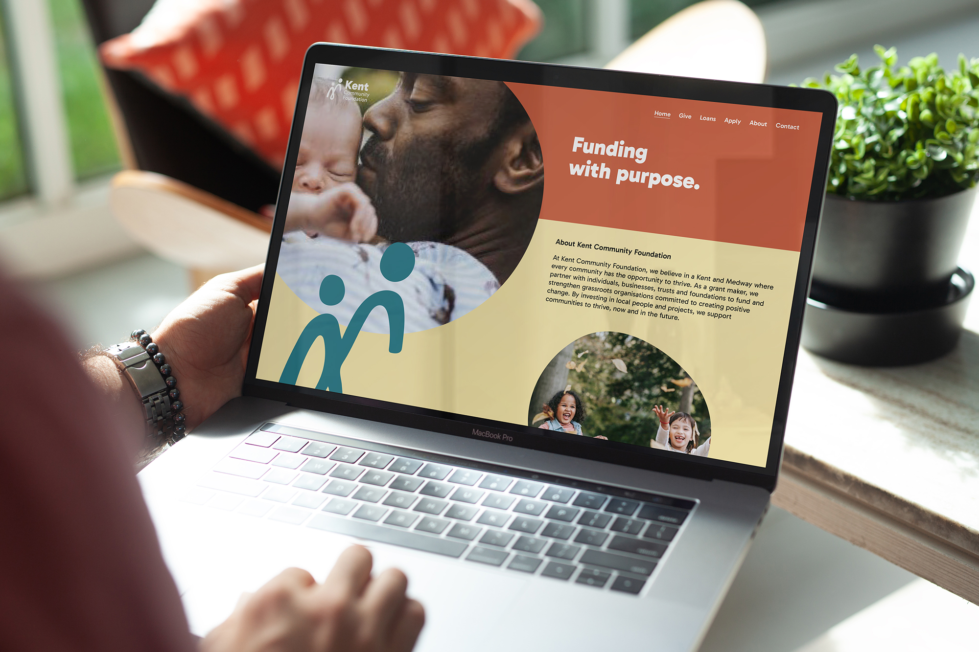
Since 2001, Kent Community Foundation has been at the heart of local philanthropy, distributing over £60 million to grassroots charities across Kent and Medway. As they approached their 25th anniversary, the team recognised that while the organisation was highly respected, its visual identity was no longer keeping pace with its ambitions, or the accessibility standards it actively champions.

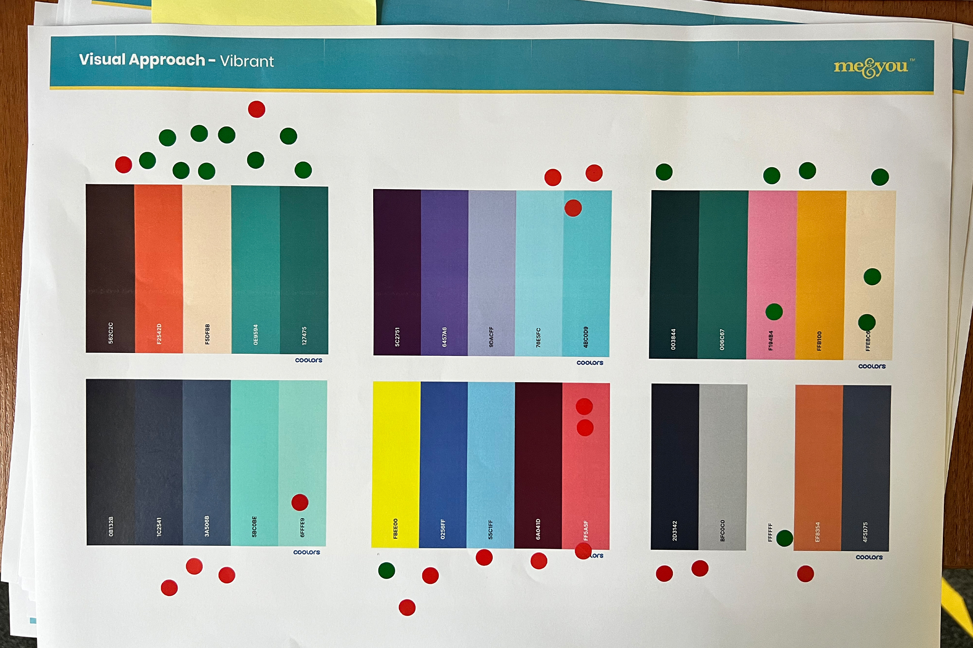
An accessibility audit revealed that parts of the existing colour palette failed contrast checks, creating barriers for some digital users. But the challenge ran deeper than compliance. Strategically, the brand needed to better reflect a future-focused organisation: one that remained warm and approachable for grassroots charities, while also feeling dynamic, confident and credible to high-net-worth donors and professional advisors. All of this needed to be achieved without losing the much-loved Oast House that had become a symbol of Kent Community Foundation’s deep local roots.

The Solution

From the outset, the brand refresh was a collaborative process. We ran interactive workshops with staff and trustees to ensure the new brand was shaped together, not imposed. Practical sessions helped us understand people’s differing views and why certain legacy elements really mattered.

Rather than a complete overhaul, we took an “evolution, not revolution” approach. The Oast House was reimagined as a more fluid, organic mark, moving away from a literal building towards a symbol of connection, energy and community.

Accessibility was considered from day one. We rebuilt the colour palette to be vibrant, flexible and fully compliant, and delivered a practical brand toolkit that works in the real world. Clear guidelines, alongside assets for both InDesign and Canva, empowered the internal team to confidently apply the brand across print and digital.

Impact

The refreshed brand strikes the balance Kent Community Foundation was looking for: professional enough to sit alongside wealth managers and advisors, yet welcoming and human for the grassroots charities they support.

Because the team and trustees were involved throughout, the new identity landed with a strong sense of ownership and pride. It has already laid the groundwork for a full website overhaul and their upcoming 25-year anniversary campaign, launching in 2026.

Most importantly, accessibility is no longer an afterthought, it’s built into the brand’s DNA, reinforcing Kent Community Foundation’s commitment to equity, diversity and inclusion.

The old brand was starting to feel dated. The new identity gives us the energy and optimism we need for the next stage of our journey. The brand is the team — and seeing everyone proud to work under it is how we know it’s a success.


Hannah Hayfield Communications Manager, Kent Community Foundation