• Call Us 01732 749 748
    [email protected]

  • We will never share your details with other organisations.
    View our privacy statement for more details.

  • This field is for validation purposes and should be left unchanged.

Close

A rebrand with wide appeal for a housing provider

GCHA provides housing to people of all ages and backgrounds; they needed their rebrand to reflect this diversity and appeal to their multiple demographics


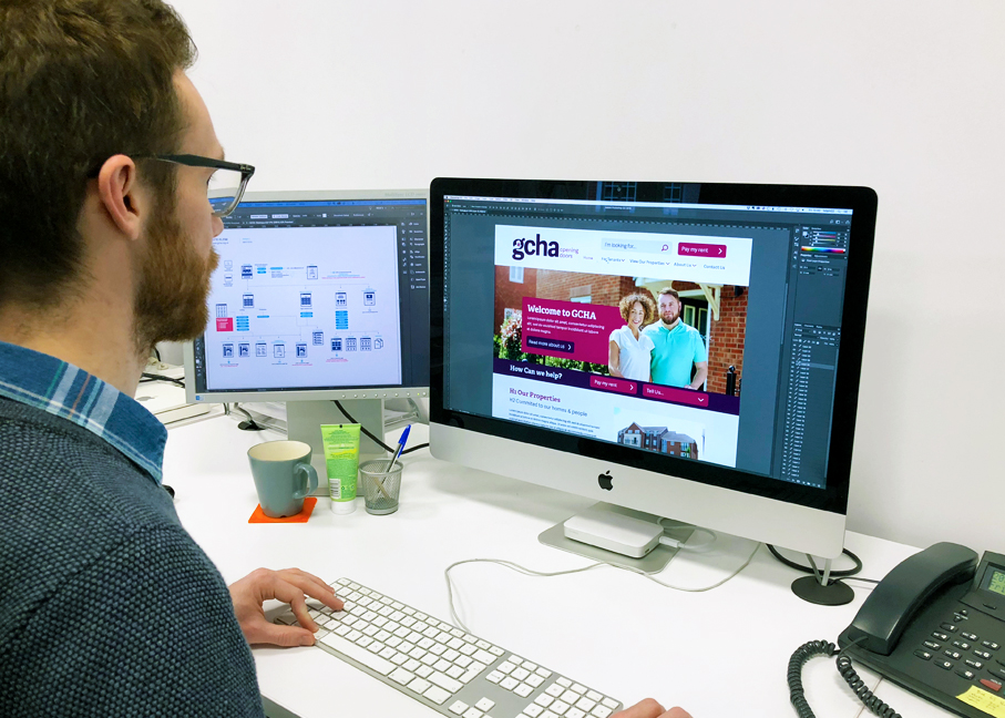
The client asked me&you to rebrand the whole company, including a new logo mark, printed marketing material and a website.

Its unusually diverse demographic meant that we needed to come up with a concept that would appeal to a very wide audience. Finding the right balance was key.

Choosing the right identity

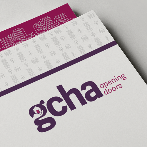
Because of the large and varied demographic, we knew that the visuals should be literal, with a friendly colour palette and supporting iconography to add character to the brand.

Overall, we wanted a clean, clear and modern mark, so we selected a sans serif font and manipulated the ‘g’ using negative space to add a personalised touch, incorporating a house icon and hand to represent the care and welfare GCHA provides

Brand roll-out

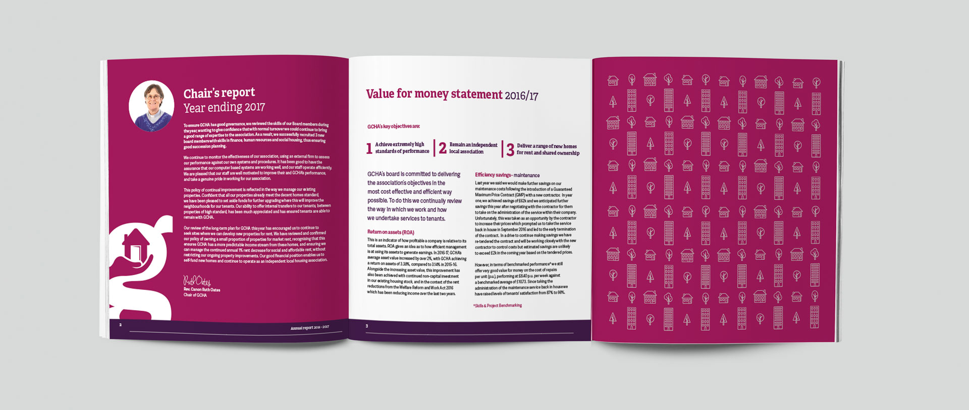
We created a whole new suite of imagery and supporting icons to roll out across all digital and print platforms.

Inspiring air ambulance charity supporters with a refreshed magazine design

Creative support and content creation for a poverty alleviation charity

Powering Kent's sustainable future with a fresh new brand identity