• Call Us 01732 749 748
    [email protected]

  • We will never share your details with other organisations.
    View our privacy statement for more details.

  • This field is for validation purposes and should be left unchanged.

Close

Powering Kent’s sustainable future with a fresh new brand identity

me&you created a flexible new brand identity to help a community energy initiative communicate their purpose more clearly.


Challenge

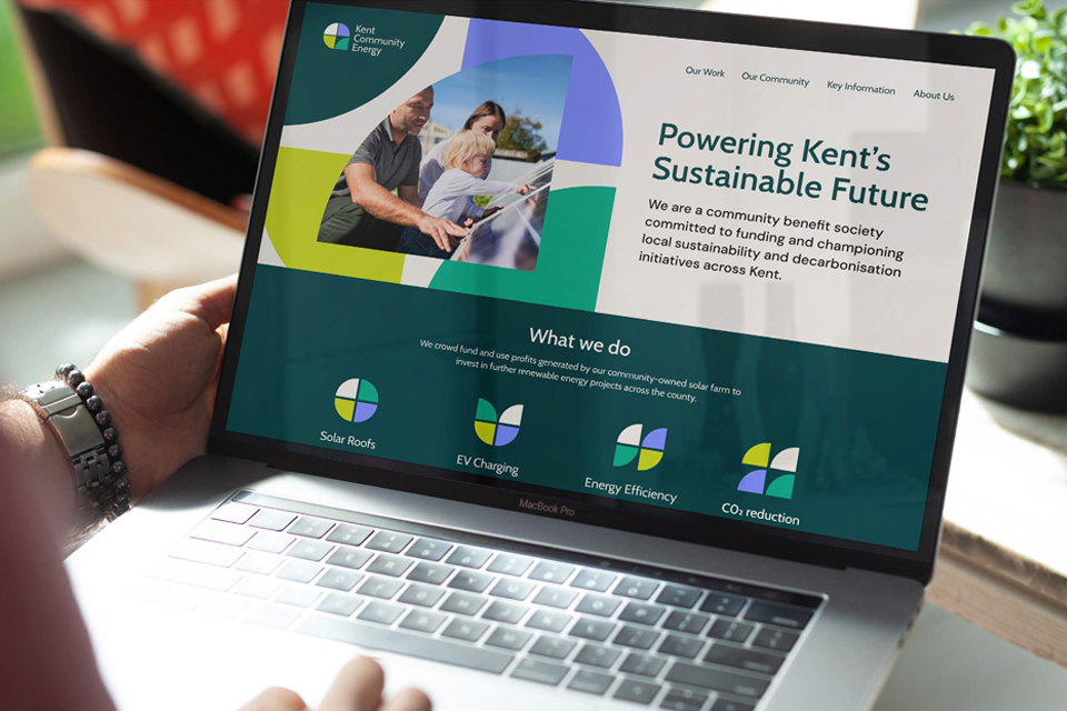
Kent Community Energy (KCE) is a community benefit society committed to funding and championing local sustainability and decarbonisation initiatives across Kent. They use profits generated by their community-owned solar farm to invest in further renewable energy projects across the county.

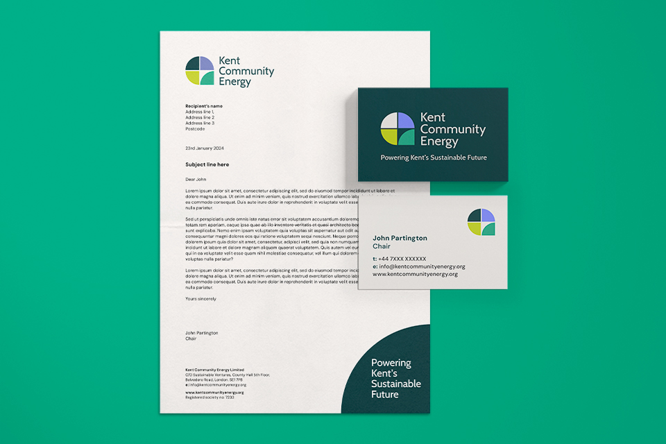
They realised the need to update their old visual identity to create a more professional first impression when approaching potential strategic partners.

During our initial discovery sessions with Kent Community Energy, the team shared that it often took them considerable amounts of time to explain their purpose and activities whenever they spoke to someone new.

It became apparent that one of their primary needs was to communicate with more clarity, both in their visual identity and the way in which they spoke about themselves.

Solution

We created a flexible new brand identity that communicates ‘positive change’ through the transformation of elements. The concept reflects Kent Community Energy’s continuously evolving social impact on local communities and contribution to decarbonisation.

The colour palette is fresh and modern, reflecting the brand’s sustainable credentials without being clichéd or overly literal. The colours and bold graphic shapes help make them visually distinctive among their peers. 

Once the creative concept was agreed upon, we provided the client with brand assets and a brand toolkit (also known as brand guidelines). This was designed to provide guidance to the KCE team on how to ensure the brand was consistently applied going forwards. 

This toolkit set out suggestions for brand photography style, how to use the logo and gave examples of the brand in action. We also created a set of powerpoint templates, a suggested website homepage design and an infographic that simplified the key aspects of what they do.

As part of the brand toolkit, we provided the client with an online facility where they could filter and download their brand assets depending on where it would be used. This ensured that the client would always use the correct right file types on their website, presentations and print assets.


Impact

Kent Community Energy is not a profit-making energy company, but rather a brand for social and environmental good. Their old brand identity was cliched and overly literal, whereas their new brand identity also represents ‘social community’ rather than just ‘solar energy.’ Accompanied by a powerful new strapline, KCE can now communicate what they are all about more clearly with their audiences.

Kent Community Energy is run by a small team of dedicated volunteers and the new identity has freed up the time they had been spending answering repeated questions and giving long explanations during presentations.

The KCE team were delighted with how we handled the project and now have a brand that they are proud and confident to approach new partners with.

“We asked me&you for a complete design review including establishing the design standards, logo and website design refresh. They were very organised, responsive and creative. They listened well and responded to client concerns. Their communication was excellent, friendly and timely. Work was executed on time and to a high standard.”


Michael Bax Kent Community Energy