by Kate Wright
To keep our ideas fresh on food and drinks packaging, the Graphic Designers at me&you held a ‘show and tell’ this week.
We looked at the food and drinks packaging designs that we loved and hated, and it was illuminating!
Ugly packaging
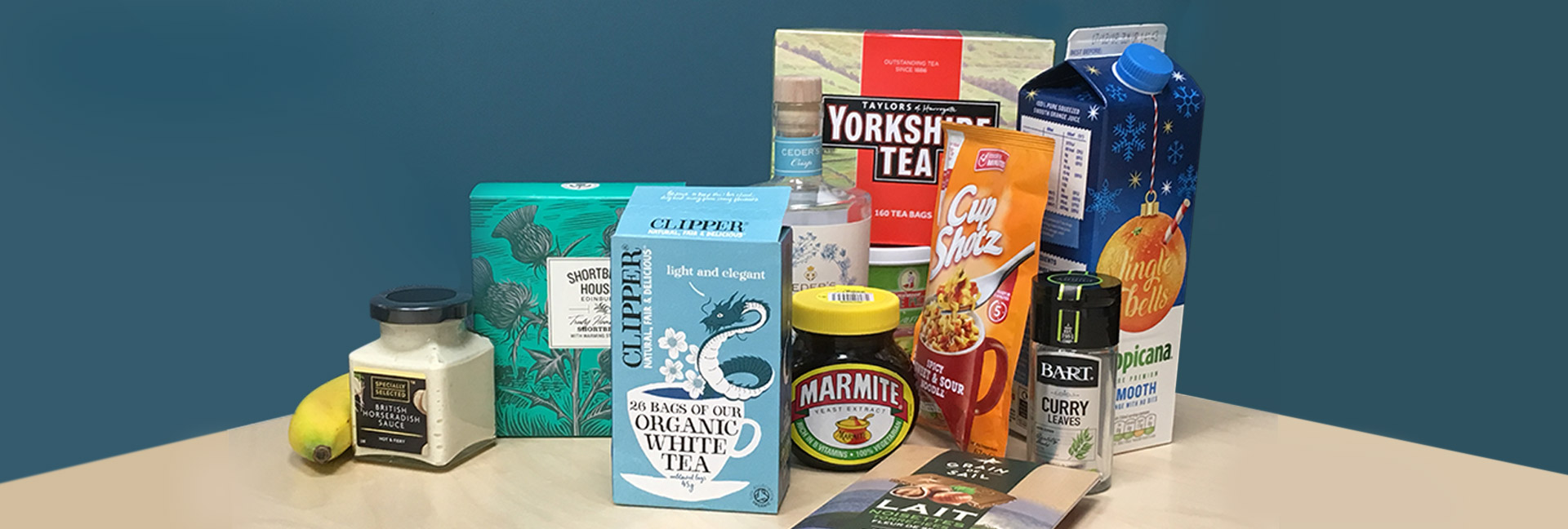
Starting with the ‘ugly’, Cup Shotz noodle packaging takes the bold and inadvisable step of combining bright orange with bright red, and the result is far from appetising. Other crimes against taste include replacing an ‘s’ with a ‘z’ and that drop shadow. However, as branding people we acknowledge that Aldi are positioning this product as being cheap above all, and want to communicate this clearly. I’m sure they sell well on this basis. We see the use of the colour orange as a communicator of low price elsewhere in branding of course, with Easyjet for example.
Good packaging
A ‘good’ piece of food and drinks packaging design in our view is Marmite. You will have diverging opinions on the taste of Marmite, but as a jar on the supermarket shelf everyone would agree that it has the great strength of a distinctive design. The individuality that comes from its dark brown bulbous glass jar was created in the 1920s. We love seeing iconic designs that still sit well in a contemporary context - don’t change it, Marmite!
In contrast with that bold design, our designers admire the more subtle charms of organic tea packaging for Clipper, biscuit packaging for Shortbread House of Edinburgh and elegant Ceder’s Crisp, a non-alcoholic gin. These three all have illustrations of nature in common, and with a vintage, hand-drawn look, their brands convey that these are food and drinks aimed at female consumers, they are limited editions, and are a little bit special rather than being mass-produced.
I must admit we had a chuckle about the price of Ceder’s Crisp at £22 a bottle for a non-alcoholic drink, whereas a cordial such as Belvoir is around £3, but good luck to them. We understand the premise that if you don’t want to drink, you miss the ‘sophisticated, interesting, adult drinking experience’ and appreciate something special. They are succeeding in using brand (as well as good ingredients) to communicate ‘we are premium’ in their food and drinks packaging.
Oven Baked Sweet Potatoes by Dublin-based start-up food company ‘Strong Roots’ has great packaging, and was a top choice for our Creative Director. And what a welcome entry to the frozen food market, where packaging design has perhaps been less innovative. The typography made us think of artisan beer or posh crisps packaging design, and so makes our vegetable-buying more exciting!
Bad packaging
Thai Taste ‘Gaeng Leung Pak Tai’ curry paste is relegated to our packaging Hall of Shame, due to the outdated design of its label but also the impracticality of using the product. When we try to take out a spoonful, the bag flops out, creating a mess and wastage. Sorry Thai Taste, but ‘must try harder’.
Clever packaging
In our packaging ‘show and tell’, respect was given to the lid on a Bart herbs and spices jar. It opens both ways, depending on whether you’re after a sprinkle or a spoonful!
Our own food and drinks packaging designs
A favourite food and drink packaging project from our own design studio at me&you, is the soft drinks packaging for The Original Drinks Co. We provide food and drinks companies with distinctive label designs, to really appeal to their target market, and make the consumer feel GOOD about their product.
Lastly, in our packaging brainstorm, we didn’t forget to pay homage to the ultimate piece of food packaging - the humble banana!
See more branding work by me&you
Further reading on food and drinks packaging and branding
Food packaging UK news:
www.packagingnews.co.uk/news/markets/food
Drinks packaging UK news:
www.packagingnews.co.uk/news/markets/drinks
How Aldi is competing with big brand names:
www.marketingweek.com/2018/06/15/aldi-like-brands
Choosing a colour for your packaging:
https://packhelp.com/
The use of the colour orange in design:
www.sitepoint.com/color-in-design-orange
The Sunday Times review of non-alcoholic drinks:
www.driving.co.uk/news/products/non-alcoholic-spirits-reviewed