by Louise Barden
Like all charitable organisations, it’s vital that cancer charity Look Good Feel Better gives every one of their income streams the best chance of success so that they can continue their important work.
Earlier this year they asked me&you to help improve their online shop and solve the problems their customers were encountering with it. Having already designed Look Good Feel Better's main charity website during the challenge of Covid-19, we were delighted to help the LGFB team to optimise their existing ecommerce site.
We started by listening to the team and the feedback they had been receiving from visitors to the site. We then carried out an audit of the site and highlighted opportunities to improve the site’s usability in order to deliver more income for the charity. Once we had visuals signed off, our developer made the site updates live.
So, what improvements did we make?
1. Easier filtering
When me&you first looked at the online shop, there were 24 products listed but way to filter them. This meant that customers were scrolling through a lot of products to find what they were looking for, especially when viewing the site on a mobile.
We added filtering functionality which would allow customers to easily filter products by category, price or brand.
2. Improved legibility
The text on the product description was very feint with overly large line spacing, making it quite difficult to read. Where there were dropdown boxes to choose clothes size or colour, the boxes were unclear meaning customers were unsure what the options were or what actions were required of them.
We increased the legibility of the text by choosing a heavier weight font, closing up the line spacing and making the overall user journey clearer.
3. Clearer signposting
Alongside their own branded merchandise, Look Good Feel Better receive proceeds from a number of products made by other brands such as Avon, Yardley and Philip Kingsley. The problem was that customers were not aware that they would be purchasing these products directly from partner’s sites rather than the Look Good Feel Better shop.
We made it clear on the product description and by using pop-up messaging, when customers would be purchasing the product from a 3rd party site, as well as reassuring them that LGFB would receive a percentage of the proceeds.
4. More user friendly shopping process
The site’s shopping cart had too many unnecessary buttons. There was a button to apply a discount code, one to continue shopping, one to update the cart, this made it unclear how the customer was to navigate through to checkout.
We made the purchasing process much clearer by removing or redesigning unneeded buttons. We also added the option to change the quantity of the product in the shopping cart and made the text more legible.
5. Encouraging donations
As the saying goes, those who don’t ask, don’t get. One of the most successful changes we made to the site was to include a panel on the checkout page giving customers the option to add a donation to Look Good Feel Better. As visitors to the site were already interested in supporting the charity, it was a simple idea to ask for donations at the point of sale.
We used photos and a few lines of text highlighting what various donation amounts would pay for, from funding hospital parking for a workshop volunteer, to recruiting and training a new workshop facilitator.
6. Greater visibility for promotions
We utilised an underused area on the shop homepage to promote LGFB’s seasonal focus whether it be goodie bags or their annual raffle. We also gave the team the option to add a promotional banner in the shopping cart to encourage spontaneous purchases of raffle tickets.
This year’s raffle has been their most successful to date.
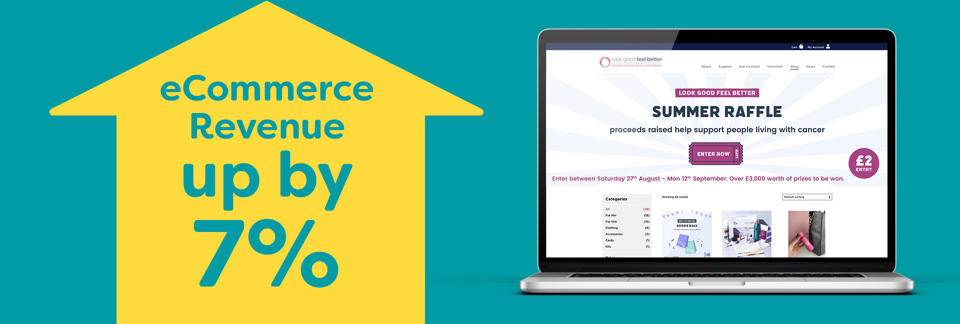
What difference have the updates made?
By making these simple changes to Look Good Feel Better’s online shop, their income from the site is up 7% in 2022 compared to the year before. It has also reduced the amount of reported issues with the shop that the team have had to deal with to almost none.